Now that Laser Moose and Rabbit Boy is available for preorder, I thought it might be a good time to talk about the process of creating the cover. As usual, it started with sketches on sticky notes…
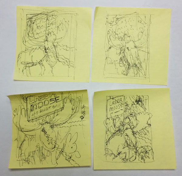
From the beginning, I had a clear idea of what I wanted the cover to look like. First, I wanted it to show Laser Moose shooting lasers, because he isn’t called “Laser Moose” for nothing, right? And second, I wanted to emphasize the relationship between Laser Moose and Rabbit Boy and show how much fun these guys have when they’re leaping through the forest together.
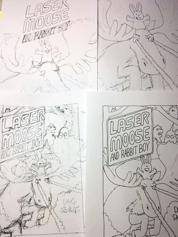
The “Laser Moose and Rabbit Boy” logo evolved over time. I started with the “Laser Moose” text I used in my first ever drawing of Laser Moose. And I wanted it to have a bit of a late-70s iron-on patch sort of feel to it.
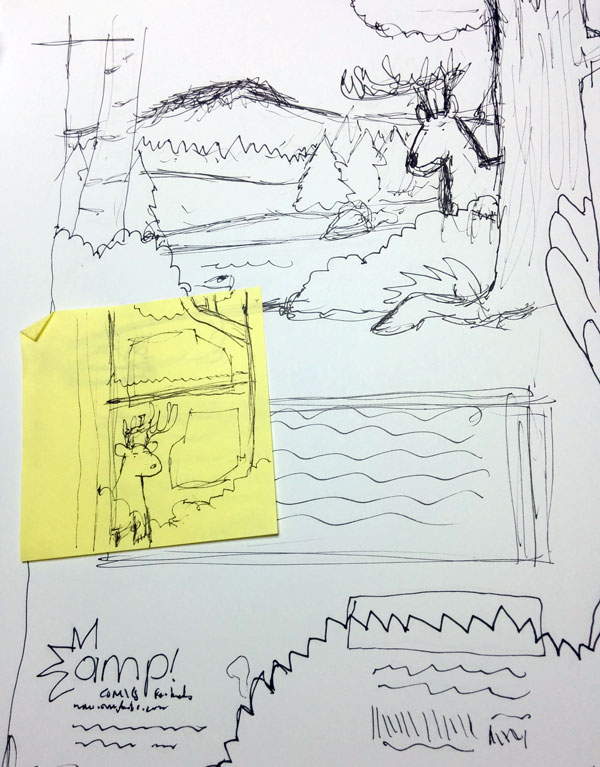
At first, I didn’t really have a solid idea of what I wanted to put on the back cover, except that I wanted it to be a continuation of the scene on the front cover. After a few sketches, I decided it would be great to put Frank the Deer on the back, looking perturbed as usual.
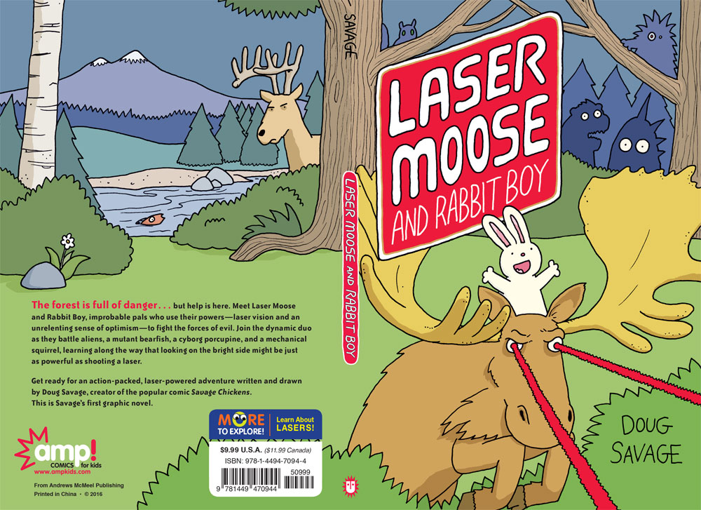
Several drawings later, I scanned my final art and colourist J. L. Martin and I added colour in Photoshop, with sage advice from Julie Barnes at AMP Comics for Kids.
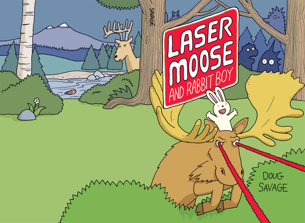
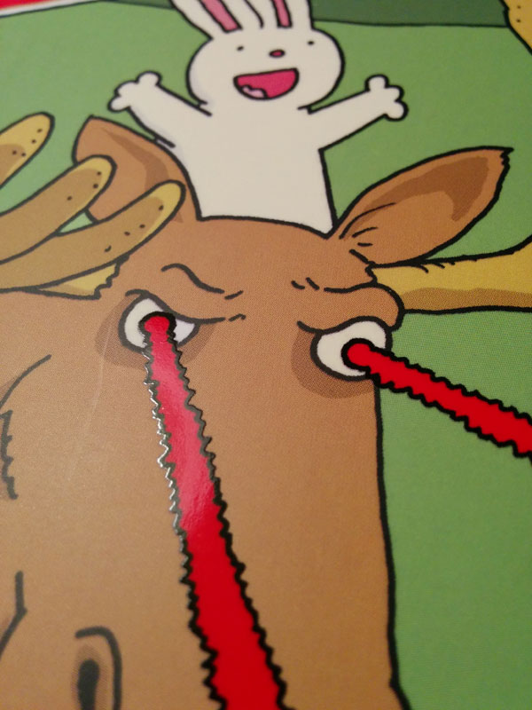
Then, Julie added all of the final touches – the book blurb and AMP logo and so on – to create the final cover you see at the top of this post. And, for a final touch, the printer added a layer of gloss to the red bits on the cover, so the lasers look like they’re coming right at you!
It’s a cute book. Great cover
Thanks Laura! 🙂